
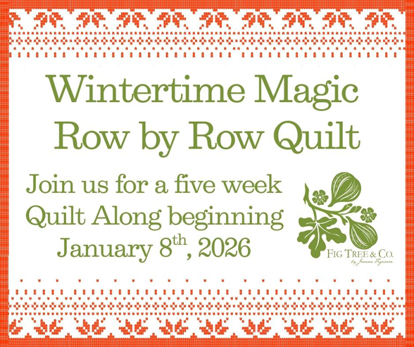
WINTERTIME SEW ALONG: A FEW COLOR HINTS TO THINK ABOUT
We are getting excited for our upcoming WINTERTIME SEW ALONG starting tomorrow and I wanted to talk a bit about color.
I have gotten a lot of questions about how to pick fabrics, especially since this project is technically a mystery… so here are some thoughts that I have come up with.
And if this is your first time hearing about our sew along, be sure to check out THIS BLOG POST for the official introduction, which includes fabric requirements, pattern details, the sew along schedule, and much more.
[PATTERN UPDATE: If you missed out on our WINTERTIME MAGIC ROW BY ROW Sew Along, don’t despair! We hope to make the sew along series into a pattern in time for next winter.]
……
OUR COLOR SCHEME
As you can see, we have chosen a limited color palette for our project with 3 main colors, several ivory based background prints, and a grey accent fabric. We based the entire quilt on the sweater we showed you IN THE FIRST POST so that inspiration pretty much dictated the whole palette for me.

THE COLORS: We are using reds, coral pink and pine greens as our three colors. So if you are choosing your own fabrics but staying with our color scheme, then you will want to choose something similar in terms of the colors. I highly suggest sticking with small prints similar to the ones shown here for successful blocks [see more below].
YOU WILL WANT TO PICK:
- Two tones of red in small prints [dots, tiny flowers, small geometrics].
- Two tones of pine green and a third green that is a bit lighter than the first who that can be used as an accent when laid right next to the other greens.
- A soft background that is a solid or a tone on tone like the IVORY WHITE ON WHITE EYELET.
- Two other delicate background prints to give yourself a bit of variety and sparkle. Honestly, you could use just one background print for the whole quilt but I really think a little bit of background variation adds so much to a more simple quilt such as this one.
- For your other 2 background prints, I would stick with really small prints like our IVORY EYELET WITH RED or the IVORY W/ RED + GREEN as shown. Tiny pindots would also be great as well as small shirtings, etc.
……
TYPES OF FABRICS
In terms of types of prints… I HIGHLY suggest sticking with small prints, small geometrics, dots, tiny stripes and any other prints that still “read” largely as solids. As you can see we pretty much stuck with “basic” fabrics from Fig Tree EYELETS, Robin Picken’s THATCHED collection, and Vanessa’s MAGIC DOT to round out our group. All three of these “basics” collections are meant to function as backgrounds or blender fabrics and are a great match for this project. Solids would actually also be lovely here.
I recommend staying away from busy prints, larger florals or any fabric that has a mix of colors and white. The blocks in this SEW ALONG are on the smaller side and you will want your prints to be small and delicate in order to truly make your blocks shine. Larger prints will compete with your blocks.
Below you can see two stacks of red fabrics. The ones on the left I would consider for this SEW ALONG. Even though some of them are busier than I would choose personally for the look I want, I think they would still work. The ones on the right side are the kinds of prints I would stay away from. The blocks for this project are on the smaller side and these fabrics would not look great in your blocks and would make them blend too much into the background.

……
USING YOUR STASH
Using your stash is a fabulous idea for a mystery SEW ALONG like this one. Or starting with your stash and “being okay” to add in a fabric or two from your favorite local quilt shop for that perfect compliment.
If shopping your stash, use the guidelines I gave above in terms of what kinds of fabrics to use. Try to stick with those guidelines for successful blocks throughout this SEW ALONG. Feel free to branch out into other colors or color combinations as long as you stick with small delicate prints or solids as noted.
……
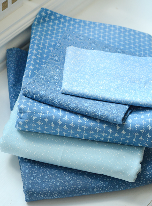
OTHER COLOR SCHEMES
You can, of course, use anything you can dream up but one particular color scheme that I think would be absolutely beautiful, would be all tones of blue on an ivory background. If this combo intrigues you, I would choose 3 different tones of blue so that you have enough variety to create your blocks- light, medium, and darker. I would still use ivory tones for the backgrounds and possibly stick with a grey blue for the accent.
Here below I just pulled blues from a mix of my DENIM & DAISIES collection as well as blues from ROSIE that is shipping next week! I would say that the difference here between the light blue, medium blue and slightly darker denim blue would be a good guide to the kind of variation you are wanting if you are going to use all one color.
If you wanted to do the same idea as above but with another color grouping… my first suggestion would be all reds or all greens! Again, make sure you have a grouping of fabrics that have enough variation from one another in tone so that they can be used in the same block and still stand out from one another.
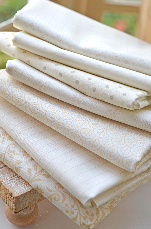
LOW VOLUME CREAMS
I have gotten a lot of questions about this so here is a bit of info on what I consider LOW VOLUME cream and ivory fabrics.
- The print part has to be small, usually repeating like dots or tiny geometrics.
- The print has to be enough far apart from each other that the fabric “reads” ivory and not the color of the print itself. Sometimes if the print is too close together or too strong, when you squint, it will “read” the color of the print instead.
- Color on the print is totally fine as long as it doesn’t overwhelm the fabric. These examples shown in this particular bundle here are all neutral but we are definitely using low volumes with red and green eyelet dots in our version of the quilt as well.
- Again, larger prints, even if tone on tone, would not be my first choice here. However, a completely tonal floral, if the contrast between the tones is really light, would be okay!
- We have added this small CREAM FILLER BUNDLE [HERE in the shop] with a few prints that we have available for those of you who want to add some sparkle into your backgrounds and don’t have much in your stash. Note that I would be very careful with that floral print on the bottom of the bundle. I might add it into filler pieces but not blocks! It is added in this bundle because it is a good cream low volume in general and we had it available even if not necessarily the greatest choice for this particular SEW ALONG in my opinion.
……
WEEK 1 STARTS TOMORROW JANUARY 8TH – SEE YOU THEN!
Happy Sewing,
-Joanna
Jeannie Boyles | 20th Jan 26
I need to purchase week one. I’ve joined the Sal now.