Catalina Coordinating Solids!
Hello Guys!
I have received so many requests and questions about Catalina related solids lately that I thought it was most definitely time to do a post about all things CATALINA SOLIDS!
First of all let me start off by saying that I design from colors in my head… or in my mind’s eye, from nature, from a vintage inspiration and not from my swatch card. Sometimes that is a lovely thing to do as an artist and it is just the way my process works but sometimes… like in this case when I am trying to find the best solids for you… it is a bit tougher because although I am in love with the bundle combo I came up with here, there are more than several of the tones that are not exactly what is in the collection. So I guess that is my disclaimer… these all “GO WITH” CATALINA 100% and look fabulous right next to it even if not every single color is exactly like its corresponding print. In my explanations below I will try to be as detailed as I possibly can be. And for those of you who have been asking about the differences between my favorite creams… stay tuned for another blog post next week.
One final disclaimer… I only use and match to MODA BELLA SOLIDS. Sometimes I see people telling others that I use this or other Kona… So I thought I would say it here :-)… I have never used a Kona fabric. I am sure they are quite lovely and definitely have some wonderful colors too but if I am every matching something to a solid or giving you coordinating names, you can safely assume that they are always MODA BELLA SOLIDS. I love them.
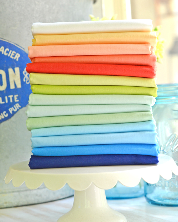
NAVY [Named Sapphire in Catalina]
First of all the name “navy” is a bit of a misnomer as the dark blue color that I like to design with is not really a navy at all but much closer to a royal blue. But most of us refer to it as the navy… so there you go.
9900-19 “Royal” is the one I have used in prior collections and a bit darker than what mine are, but a great match.
9900-261 “Sapphire” is the closest match for Catalina and definitely in the same family as royal, but a bit warmer with a bit less “dark” feel to it.
9900-396 “Lapis” is a bit brighter & more saturated and still a pretty good match to these blues.
MEDIUM BLUE [Named Ocean in Catalina]
This is that beautiful ocean blue that we are all a little bit in love with in this collection. Unfortunately there is just nothing quite like it in the bella solids. What follows comes close…
9900-306 “Cornflower” is a bit more saturated and perhaps a tiny bit brighter, but a pretty solid match [you get it… solid :-)] for this ocean blue. Its a great coordinate even if not exact.
9900-36 “Summer Sky” is a slightly lighter blue but a great coordinate and possibly my favorite “substitute” if i had to choose just one.
9900-141 “Bluebell” Slightly lighter than the one above, this one is crisper if that makes sense. Also a fabulous match so I couldn’t just pick one of the 2 and had to include both.
AQUA BLUE [Named Seaglass in Catalina]
This is a tone that I come back to often in my collections and it is the perfect “warmer” or slightly more “green” blue in this collection.
9900-132 “Breeze” is the one I would say is the closest to the color of seafoam, it is the most greenish of the light blues, but still a light aqua blue in my opinion. I love this color a lot.
9900-169 “Ruby Ice” is possibly my favorite light aqua Bella. It is a bit lighter/softer than the aqua in Catalina but it is pretty much my favorite match in its feel, even if its a bit lighter, softer.
9900-34 “Aqua” This is a bit brighter, more saturated than ours but the closest color as a true “aqua” to the aqua in the collection.
GREEN [Named Grass in Catalina]
9900-134 “Pistachio” There are several Bella greens that I love to use and over the years that has changed and evolved and I like to go back and forth between a few tones… I will have to leave all of my green info to yet another blog post. Pistachio is pretty much almost an exact match to this particular green. I absolutely love it with this collection, especially for its slightly cooler feel, even though I might use other tones with other groups.
9900- 100 “Light Lime” One of my favorite lighter greens, it is an accent in many of the prints in Catalina and a perfect coordinate so it definitely made the cut.
RED [Named Lollipop in Catalina]
9900-294 “Persimmon” The red in Catalina is a combination between several different red solids but my go to choice for spring and summer collections is for sure Persimmon as the perfect “tomato” red.
9900-258 “Geranium” A brighter more “corally” toned red, this one is also quite fantastic. It is not in the photo of this bundle because we didn’t have one at the time of photography but will be a part of the bundle on the site.
YELLOW [Named Sunshine in Catalina]
9900-148. “Soft Yellow” This is my favorite yellow these days. Especially for any summer flavored project. It is pretty much the perfect soft yellow color. Light, soft and buttery all at the same time. Hands down.
9900-36 “Butterscotch” This is my go to for any softer, warmer collection and is fairly similar to soft yellow but with a dash of warmth, and a little more depth and a tiny bit more grey. Right now Soft Yellow is not available at all and we tried adding Butterscotch to this bundle and it was a little too grey to play well in the end, so we are waiting for that soft yellow after all!
IVORY [Named Cloud in Catalina]
Like I mentioned above, I will dedicate an entirely different post to my conversation about creams and whites in general as I have definitely changed and evolved over my 15+ years of designing fabrics and patterns and still use different tones for different seasons and projects.
9900-200 and 9900-200S “Off White” and “Chantilly Off White Silky”
The silky version of this color was created especially for our Chantilly collection last year as it was our first venture into a more creamy white color rather than an ivory of any type. The only true difference between the 200 and the 200S is the “hand” of the fabric which means the processes that it has gone through to achieve the final feel. One is… you guessed it… a little bit more silky than the other. We use the fabrics interchangeably based on availability but for this bundle we have included the silky. It is the most beautiful crisp, creamy white color. A perfect match for Catalina.
ACCENT COLORS
My favorite accent colors used as the motifs in most of these prints are the light green already mentioned above as well as…
9900-296 “Cantaloupe” The perfect soft peach/apricot color and a long time favorite of mine. I use this color as an accent in many of my collections.
9900-147 “Coral”… which as its name suggests is the perfect coral color and again somewhat of a “go to” tone for me.

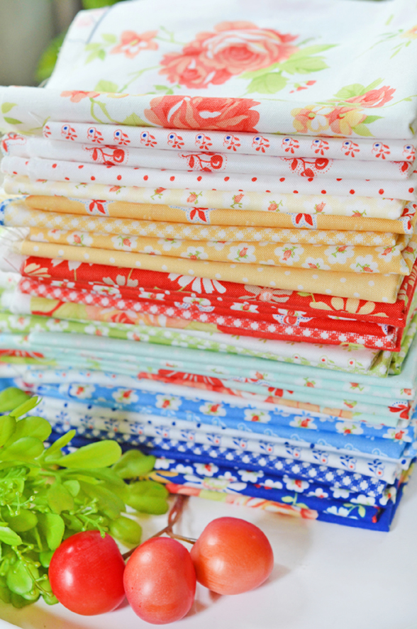
The bundle that you see here right now has the following in order from the top to the bottom: Chantilly Off White, Butterscotch, Cantaloupe, Coral, Pomegranate, Light Lime, Pistachio, Breeze, Ruby Ice, Aqua, Summer Sky, Bluebell, Cornflower, Royal. The bundle for sale in the shop might have a few changes based on additions as they arrive or omissions for fabrics that are unfortunately sold out at MODA right now so take a look at that before ordering so you know what is coming and when.
Click HERE for bundle info in the shop.
Hope this is helpful. Feel free to ask any questions below.
Alicia Hunt | 27th Apr 20
What navy blues did you use in your Regatta pattern for the bottom of sail boats?
Thank you
joanna@figtreequilts.com | 28th Apr 20
2 of the prints from the Catalina collection… dots and gingham I believe.